.svg "Atlas by CP horizontal Cyan dot on Light (March 2026)")


In this post I will show you how to create a component with expandable functionality in an easy way and that is compatible with Android, iOS and UWP. We are not going to use Custom Renders or complex structures, so this tutorial is also perfect if you are a Xamarin beginner.
This will be the result:
As you can see in this example, we’re just going to create a label that expands another label.
Let's go then:
1. The first step is to create a new Content View for our component and name it ExpandableLabel.
2. In our new ContentView we are going to create this simple XAML structure:
<ContentView
    x:Class="DemoApp.ExpandableLabel"
    xmlns="http://xamarin.com/schemas/2014/forms"
    xmlns:x="http://schemas.microsoft.com/winfx/2009/xaml">
    <ContentView.Content>
        <StackLayout
            Padding="0"
            BackgroundColor="White"
            Spacing="0">
            <StackLayout
                x:Name="Header"
                Padding="10"
                BackgroundColor="Accent"
                HorizontalOptions="FillAndExpand">
                <Label x:Name="TitleText" Text="This is the title" />
            </StackLayout>
            <StackLayout
                x:Name="ExpandableLayout"
                Padding="0"
                HorizontalOptions="FillAndExpand">
                <StackLayout x:Name="ExpandableContent" Padding="10">
                    <Label x:Name="ExpandableText" Text="This is the expandable text" />
                </StackLayout>
            </StackLayout>
        </StackLayout>
    </ContentView.Content>
</ContentView>
As you can see, we have a Stacklayout with two 2 Stacklayouts:
Header - > This will be the part of the component that always is being showed. In this case we just added a Label (TitleText).
ExpandableLayout -> This will be the part of the component that will be expandable. Inside the ExpandableLayout we have included another Stacklayout named ExpandableContent, in which we will include the content. In this case we just added a Label (ExpandableText).
3. We are going to use this Content View in one view and take a look at the result:
<ContentPage x:Class="DemoApp.MainPage" xmlns="http://xamarin.com/schemas/2014/forms" xmlns:x="http://schemas.microsoft.com/winfx/2009/xaml" xmlns:local="clr-namespace:DemoApp" BackgroundColor="#EFEFF4"><StackLayout Padding="0,20,0,0" Spacing="0"> <local:ExpandableLabel HorizontalOptions="FillAndExpand"/> </StackLayout></ContentPage>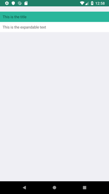
Ok, it looks cool, but not really useful. It's time to add some code!
4. We are going to assign 0 opacity to the ExpanbleLayout and add a TapGestureRecognizer on the Header Stacklayout. This will be the way to expand and contract the content:
<?xml version="1.0" encoding="UTF-8" ?>
<ContentView
    x:Class="DemoApp.ExpandableLabel"
    xmlns="http://xamarin.com/schemas/2014/forms"
    xmlns:x="http://schemas.microsoft.com/winfx/2009/xaml">
    <ContentView.Content>
        <StackLayout
            Padding="0"
            BackgroundColor="White"
            Spacing="0">
            <StackLayout
                x:Name="Header"
                Padding="10"
                BackgroundColor="Accent"
                HorizontalOptions="FillAndExpand">
                <StackLayout.GestureRecognizers>
                    <TapGestureRecognizer NumberOfTapsRequired="1" Tapped="Title_Clicked" />
                </StackLayout.GestureRecognizers>
                <Label x:Name="TitleText" Text="This is the title" />
            </StackLayout>
            <StackLayout
                x:Name="ExpandableLayout"
                Padding="0"
                HorizontalOptions="FillAndExpand"
                Opacity="0">
                <StackLayout x:Name="ExpandableContent" Padding="10">
                    <Label x:Name="ExpandableText" Text="This is the expandable text" />
                </StackLayout>
            </StackLayout>
        </StackLayout>
    </ContentView.Content>
</ContentView>public partial class ExpandableLabel : ContentView
{
private bool _IsExpanded;
private bool _IsExpanding;
public ExpandableLabel()
{
InitializeComponent();
ExpandableLayout.HeightRequest = 0;
}
private async void Title_Clicked(object sender, EventArgs e)
{
if (!_IsExpanding)
{
_IsExpanding = true;
var height = ExpandableContent.Height;
if (_IsExpanded)
{
var animation = new Animation(v => ExpandableLayout.HeightRequest = v, height, 0);
await ExpandableLayout.FadeTo(0, 250);
animation.Commit(this, "ExpandSize", 16, 250);
}
else
{
var animation = new Animation(v => ExpandableLayout.HeightRequest = v, 0, height);
animation.Commit(this, "ExpandSize", 16, 250);
await ExpandableLayout.FadeTo(1, 250);
}
_IsExpanded = !_IsExpanded;
_IsExpanding = false;
}
}
}
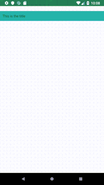
First of all, we assign 0 to ExpandableLayout.HeightRequest to not show it when the control appears.
Then we have added the Click event to expand and contract the ExpandableLayout. We use the ExpandableContent Stacklayout as reference for the height that ExpandableLayout should have when it is expanded.
Then we have to create a custom animation and a fade animation to make a smooth and natural transition when the container changes its height.
If we test now the result looks really great:
6 - But as we are creating a Content View and our intention is to re-use this component we are going to add BindableProperties to modify the TitleText and ExpandableText of this component directly from the Xaml
<ContentView
    x:Class="DemoApp.ExpandableLabel"
    xmlns="http://xamarin.com/schemas/2014/forms"
    xmlns:x="http://schemas.microsoft.com/winfx/2009/xaml">
    <ContentView.Content>
        <StackLayout
            Padding="0"
            BackgroundColor="White"
            Spacing="0">
            <StackLayout
                x:Name="Header"
                Padding="10"
                BackgroundColor="Accent"
                HorizontalOptions="FillAndExpand">
                <StackLayout.GestureRecognizers>
                    <TapGestureRecognizer NumberOfTapsRequired="1" Tapped="Title_Clicked" />
                </StackLayout.GestureRecognizers>
                <Label x:Name="TitleText" Text="{Binding Title}" />
            </StackLayout>
            <StackLayout
                x:Name="ExpandableLayout"
                Padding="0"
                HorizontalOptions="FillAndExpand"
                Opacity="0">
                <StackLayout x:Name="ExpandableContent" Padding="10">
                    <Label x:Name="ExpandableText" Text="{Binding Text}" />
                </StackLayout>
            </StackLayout>
        </StackLayout>
    </ContentView.Content>
</ContentView>
public static readonly BindableProperty TitleProperty = BindableProperty.Create(
    propertyName: "Title",
    returnType: typeof(string),
    declaringType: typeof(ExpandableLabel),
    defaultValue: default(string));

public static readonly BindableProperty TextProperty = BindableProperty.Create(
    propertyName: "Text",
    returnType: typeof(string),
    declaringType: typeof(ExpandableLabel),
	defaultValue: default(string));

public string Title
{
    get
    {
        return (string)GetValue(TitleProperty);
    }
    set
    {
        SetValue(TitleProperty, value);
    }
}

public string Text
{
    get
    {
        return (string)GetValue(TextProperty);
    }
    set
    {
        SetValue(TextProperty, value);
    }
}

protected override void OnPropertyChanged(string propertyName = null)
{
    base.OnPropertyChanged(propertyName);
    if (propertyName == TitleProperty.PropertyName)
    {
        TitleText.Text = Title;
    }
    else if (propertyName == TextProperty.PropertyName)
    {
        ExpandableText.Text = Text;
    }
}

public ExpandableLabel()
{
    InitializeComponent();
    ExpandableLayout.HeightRequest = 0;
    ExpandableText.Text = Text;
    TitleText.Text = Title;
}
<?xml version="1.0" encoding="utf-8" ?>
<ContentPage
    x:Class="DemoApp.MainPage"
    xmlns="http://xamarin.com/schemas/2014/forms"
    xmlns:x="http://schemas.microsoft.com/winfx/2009/xaml"
    xmlns:local="clr-namespace:DemoApp"
    BackgroundColor="#EFEFF4">
    <StackLayout Padding="0,20,0,0" Spacing="0">
        <local:ExpandableLabel
            Title="Title 1"
            HorizontalOptions="FillAndExpand"
            Text="Text 1" />
        <local:ExpandableLabel
            Title="Title 2"
            HorizontalOptions="FillAndExpand"
            Text="Text 2" />
        <local:ExpandableLabel
            Title="Title 3"
            HorizontalOptions="FillAndExpand"
            Text="Text 3" />
    </StackLayout>
</ContentPage>
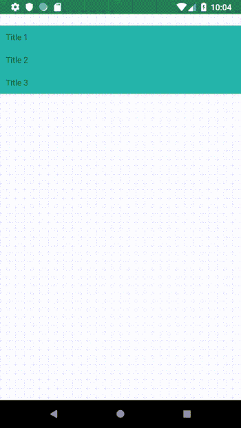
As you can see it was easy to create an expandable component and with some small modifications you can adapt it to your preferences.
Here you have the code used in this post.
Have a nice day and never stop expanding your knowledge ;)


/Icons/X-Logo%201-1.png)
